How Long To Smoke Chicken Wings? – The Complete Guide For Every Smoking Temperature
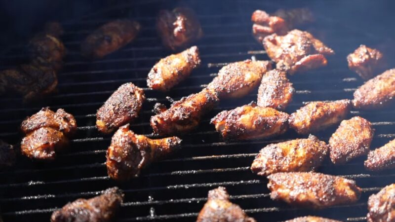
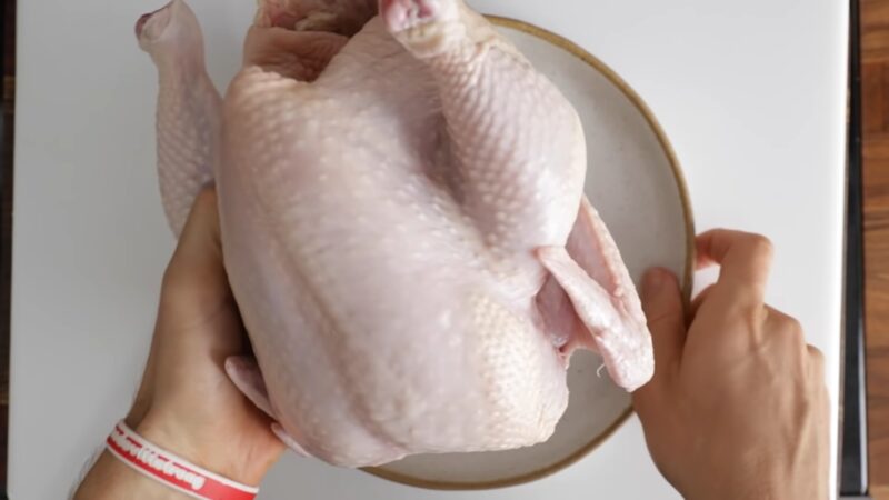
Smoking chicken wings is an art that combines the right balance of temperature, time, and seasoning to create a mouth-watering delicacy. Understanding how long to smoke chicken wings at various temperatures is crucial because that is the only way to secure the perfect chicken every time. It is a popular cooking method that infuses the … Read more